Interior Paint Selection 101

Did you know that Purple Cherry Architects has a full-service Interior Design team?  Our Interior Design services can be utilized independently or in conjunction with our architectural design services. Today, we tapped into the expertise of the design team to compile our top seven tips for selecting paint color and sheen for every room in your home.

1. Exercise your patience.
Believe it or not, paint is one of the last decisions we make – and it is usually one of our clients’ first questions at the start of the design process! Just like how you can box yourself into a corner, you can box yourself into a design by choosing a paint color too early in the process. By choosing an exact paint color and designing around this color, you limit the design possibilities. We strive to have a general sense of a client’s desired color palette for direction but we do not select exact paint colors until after most of the other interior selections have been made. We then have our pick of thousands of beautiful colors to compliment a design.

2. Do your research – it’s worth it.
To repeat ourselves – do your research, it’s worth it! Do you lean towards warmer or cooler tones? Maybe you love the simplicity of a white wall or you are all about the drama with a bold pop. Pinterest, Houzz, and design publications are helpful tools in discovering what you are naturally drawn to. The next question is – do you see yourself living in a space like the image? You may be drawn to be certain photos but after further thought may have an emotional reaction to the “feel” of the space. Color and tonal quality can affect our mood. Many people love the look of gray tones, which have become quite popular in the last few years, but when they envision living in a gray space, they may feel differently. You may realize you prefer warmer tones over cooler tones even if in the gray family!
3. Understand transitions.
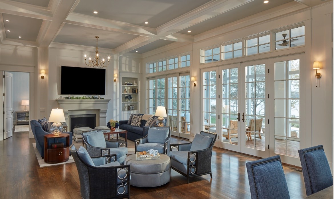
Understanding the architectural layout of your home and how paint colors transition is critical. Further, understanding the volume of the space and the orientation to natural light is significant. Our architectural and interior design teams understand the importance of these transition areas and how paint colors will transition to one another and to the light. In the increasingly popular open concept floor plan, these transitions are key and lead to us specifying fewer paint colors to avoid open sight lines with multiple paint colors. Our eye senses interruption when design elements, including paint, do not flow throughout an open space. We aim to have your eye carry seamlessly throughout your home so it picks up on all of the beautiful moments.

4. Don’t forget trim and ceilings.
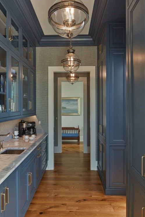
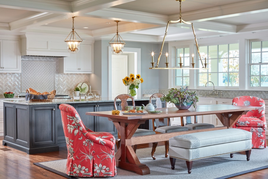
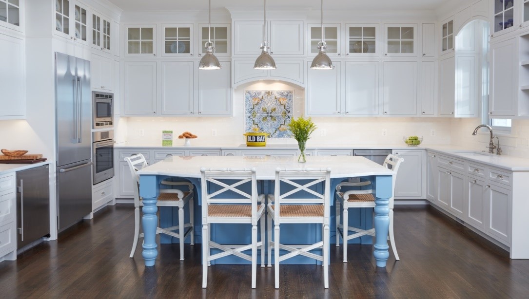
Many times, we recommend painting the trim and ceiling in the same color but in different sheens (stay tuned for sheen advice below). Going back to transition, knowing how the trim tracks from space to space or even within a single space is crucial. It is not uncommon for us to specify the same trim and ceiling color throughout an entire house. This provides a level of continuity as you move throughout your home. This approach is frequently taken in the heart of the home – the kitchen. If you love a timeless white kitchen (which many of our clients do), you will appreciate the continuity of the cabinetry matching the trim color. 
5. Utilize the existing color palette.
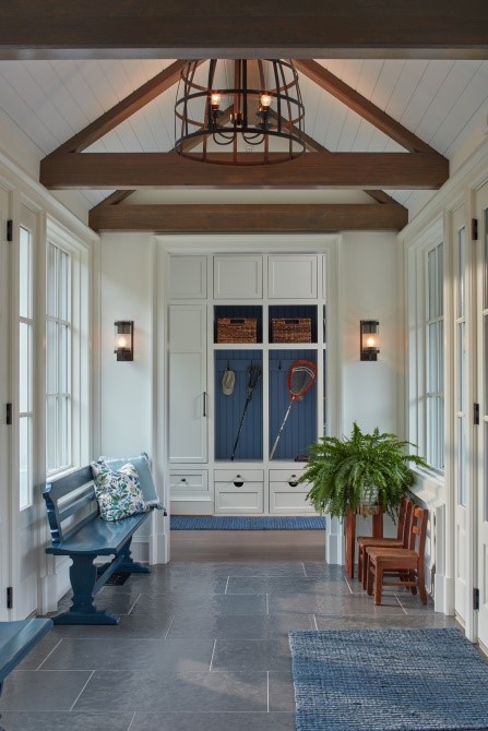
How do you select colors from here? Use the design elements and materials in the space! When we work through the design process, we select materials that tonally come together to create a holistic design. This means that the color palette is already set when it comes to selecting that perfect paint color! Our cabinetry finishes, fabrics, and rugs all influence the direction. Still wanting a bit of color? Pop a pale blue or a fun wallpaper on your ceiling to compliment your palette. One of our “go-to” collections is Benjamin Moore’s OC collection. Check it out!

6. Brush up on sheen.
Paint sheens are fairly straightforward if you keep a few guidelines in mind. There is a general rule of thumb: the higher the sheen, the higher the shine. And in turn, the higher the shine, the more durable and wipeable that surface is. More durable, sounds like a no brainer? A higher gloss sheen will also highlight any potential imperfections in your drywall. Last tip before you dive into sheens: check with your manufacturer for the differences in sheen. There are subtle differences between manufacturers.
PCA Cheat Sheet:

  • Flat paint = No Shine
  • High Gloss= All Shine
  • Eggshell, Satin, & Semi-Gloss = In between Flat & High Gloss

Ceilings and trim are also fairly straightforward. We recommend flat for drywall ceilings and semi-gloss or satin for trim. Semi-gloss has been traditionally painted on trim for many years, but we are seeing a trend towards the lower sheen of satin. This sheen level provides that perfect amount to highlight the beauty of the trim profile but at a lower level of gloss.

Our “wet areas”, the bathrooms and laundry rooms, need durability against potential moisture while also avoiding the look of a high gloss sheen. As a broad stroke recommendation, an eggshell or a satin wall paint sheen will give you that extra bit of protection without the “glare” of a high gloss sheen.

7. Sample, sample, sample (and sample again).
Bigger is better! Larger format samples allow you to see the color – a 5’x5’ area should do the trick! If you are able to sample on multiple walls within a space, do it. Color can change throughout a space and light is key. If you can, live with the color and feel it. Better yet, look at the color when you will be using that particular space the most during the day or evening. And remember, you may need more than one round of samples and that is okay! Color is an important aspect of the design.

We hope you find these tips useful!
Q&A Time with PCA Interiors

You asked and we answered! There are many ways to approach interior design. With the vast amount of available products to choose from, it can be overwhelming. The interior design team at Purple Cherry Architects decided to ask our Instagram followers for their top interior design questions. Let us share with you findings and solutions…

Q: Is wallpaper dated? It seems like a big commitment.

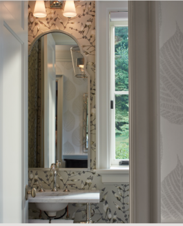
Absolutely not! It is that “little something extra.” We are seeing beautiful linens and grasscloths, subtle and bold printed patterns, and even embossed leathers. There are so many applications to use with wallpaper. Many of the homes we design have anywhere from 9’-11’ ceilings. Adding wallpaper to a space is a great way to fill a wall especially in a space with high ceilings. Get creative with where you use wallpaper! We love to add wallpaper in the back of a built-in bookcase to really make it pop. Still afraid of committing? Start small. Powder rooms are generally smaller in scale and give you an opportunity to test out your curiosity. This Zoffany wallpaper gave one of our clients the impact she wanted but still remained neutral and classic.

Q: What paint colors would you recommend for exterior stucco?

The key is to look at the house holistically and then to establish a color palette. Consider not only the stucco but also the other exterior materials such as roofing, siding, and hardscape. If you have stone or a stone veneer you will want to select a color that is pulling off of that material. We frequently specify Benjamin Moore colors found in the OC collection. These stunning paint colors, time and time again, have proven to be true staples. Try colors like Benjamin Moore Balboa Mist and China White

And don’t forget – sample, sample, sample, before you commit to a color palette! I know that when a color goes larges, it gets brighter. It takes a little more effort, but it is so worth it in the end!

Q: Do all of your metal finishes in a kitchen or bathroom need to match?

Yes and no. Does that answer the question? As interior designers, we look at the design as a whole. Between plumbing fixtures, lighting fixtures, door hardware, and all the way down to the cabinet hardware. It’s important to understand the careful balance of mixing metal finishes so that they harmonize well. We certainly specify and appreciate many metal finishes but the most common are: polished nickel, polished chrome, oil rubbed bronze, and brass. Brass has come a LONG way, and it is not the brass we all know and hate from growing up. Polished nickel and polished chrome pair nicely with both oil-rubbed bronze and brass tones. Also, the right oil-rubbed bronze and antique brass work together. It is a careful balance of combining a cooler tone metal with a warmer or darker tone metal. It can be done and it can be done well. We do have clients who prefer all of the metal finishes to match and that is ok too!

Q: I fell in love with a fabric but I am worried it won’t stand up well on a chair I am having re-upholstered. How do I know if it is durable enough to use?

There are several factors to consider when selecting a fabric for upholstery use. The weight of the fabric, and the content are essential. Upholstery weight fabrics need to be thick enough so it can stand up to use and time. If you use a fabric that is too thin, you will experience the fabric actually shifting over the cushion which will result in pilling. We frequently will do a treatment called “knit backing” which adds an extra layer to the backside of the fabric to give it more stability. Durability is a must! We hear this from our clients on a regular basis. With today’s hustle and bustle, we do not want to worry when we get home. We do not want to chase down the child, dog, or just clumsy house guest when they are using the newly upholstered chair. Knowing fabric content is key when selecting a fabric. Natural fibers will always require more care, but several fabrics are now treated with Nanotex or Crypton which are both great worry-free options! Thibaut, Kravet, and countless other vendors are all jumping on the stain treatment train.

Q: Does artwork need to match the interiors of a room?

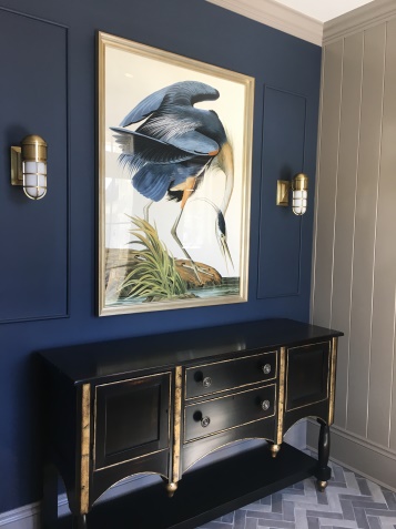
In the past, artwork has often been selected to match the room. We encourage our clients to select artwork that is subtly cohesive with the design. Pick the room’s main accent color, like a coral or even a moody teal, and have it pop an element in the artwork. Artwork is incredible, and we encourage our clients to select pieces that speak to their taste and lifestyle.

Q: I love subway tile. Is it still going to be in trend in a few years?

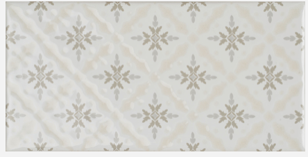
Subway tile is as classic as you can get. If you look at photos of Parisian apartments in the 1920’s, you can see subway tile gracing the walls. It is true, subway tile has “come back” but it is certainly here to stay. The clean, timeless look is the perfect backdrop for your kitchen backsplash or bathroom shower walls. Want to mix it up? Change the size, the color, the texture, or even add a pattern. Winchester Tile Company, who is carried by Chesapeake Tile in Baltimore, has a beautiful assortment of subway tile in varying sizes and designs.

Q: What rug would you recommend for a family room?

Family rooms and kitchens are the heart of the home. It is where most of clients’ families gather and spend the majority of their time together. The family room is being used as the extra office space for TV watching, game playing, and even the entertaining space when sports are on the television. Wool is the most durable natural fiber in rugs. It is cozy underfoot, has excellent insulating properties, and has good stain repellency. An additional fiber that is most commonly found in indoor-outdoor rugs is polypropylene. Perennials, who has primarily known for their fabulous indoor-outdoor fabrics, has recently launched a rug line. Their polypropylene rugs are soft to the touch and offer incredible durability. You can literally hose these rugs off! Their line has expanded where we can dream up any design or custom color any of their current patterns.

Purple Cherry Architects’ goal with each project is to create an intentional, functional and beautiful home. Our interior design team takes many approaches to formulate a design that works for the client and their lifestyle. We hope our readers have found these answers helpful and thank you to our Instagram followers for participating!

Architecture & Interiors