Interior Paint Selection 101

Did you know that Purple Cherry Architects has a full-service Interior Design team?  Our Interior Design services can be utilized independently or in conjunction with our architectural design services. Today, we tapped into the expertise of the design team to compile our top seven tips for selecting paint color and sheen for every room in your home.

1. Exercise your patience.
Believe it or not, paint is one of the last decisions we make – and it is usually one of our clients’ first questions at the start of the design process! Just like how you can box yourself into a corner, you can box yourself into a design by choosing a paint color too early in the process. By choosing an exact paint color and designing around this color, you limit the design possibilities. We strive to have a general sense of a client’s desired color palette for direction but we do not select exact paint colors until after most of the other interior selections have been made. We then have our pick of thousands of beautiful colors to compliment a design.

2. Do your research – it’s worth it.
To repeat ourselves – do your research, it’s worth it! Do you lean towards warmer or cooler tones? Maybe you love the simplicity of a white wall or you are all about the drama with a bold pop. Pinterest, Houzz, and design publications are helpful tools in discovering what you are naturally drawn to. The next question is – do you see yourself living in a space like the image? You may be drawn to be certain photos but after further thought may have an emotional reaction to the “feel” of the space. Color and tonal quality can affect our mood. Many people love the look of gray tones, which have become quite popular in the last few years, but when they envision living in a gray space, they may feel differently. You may realize you prefer warmer tones over cooler tones even if in the gray family!

3. Understand transitions.
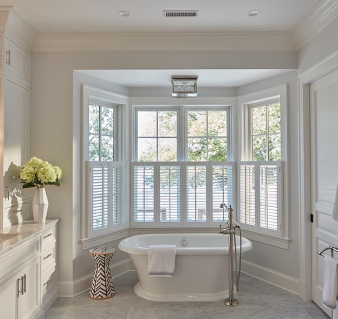
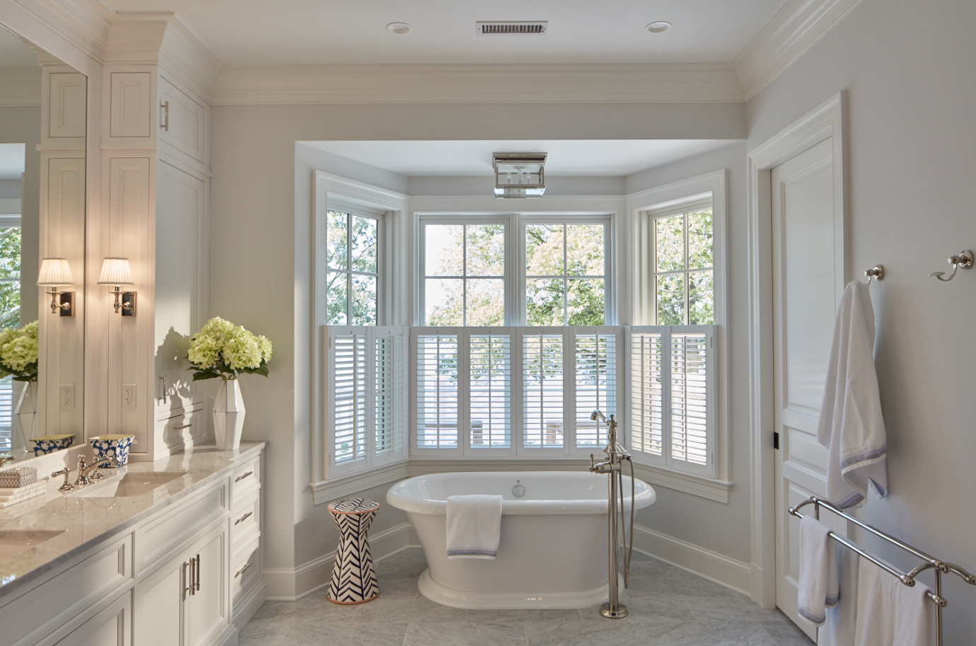
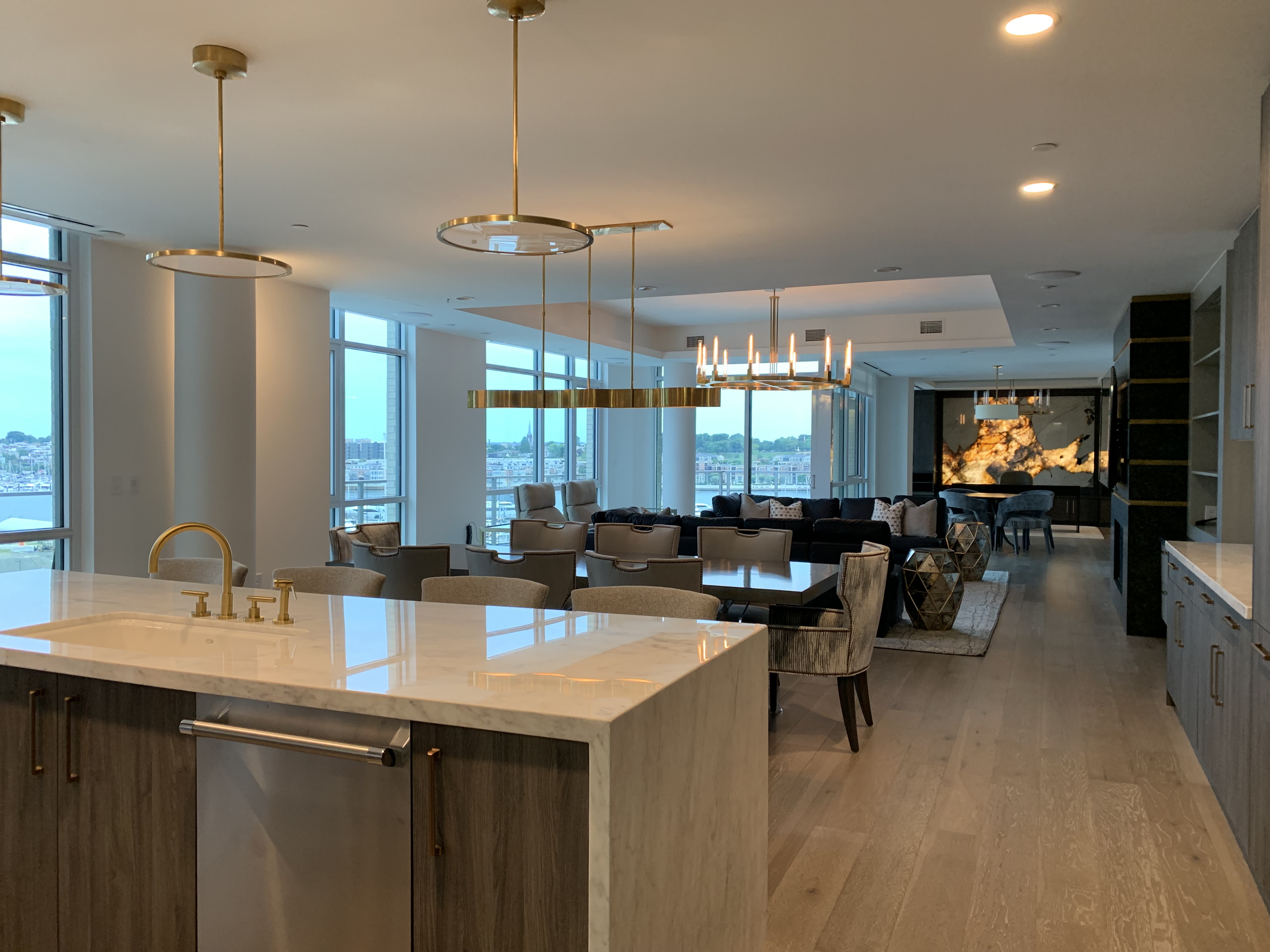
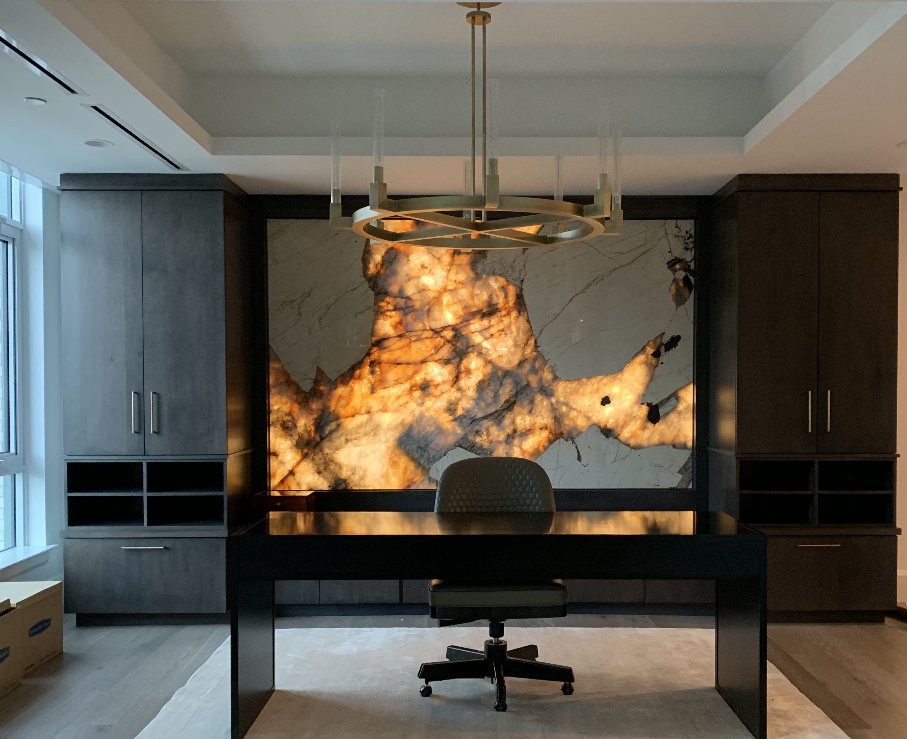
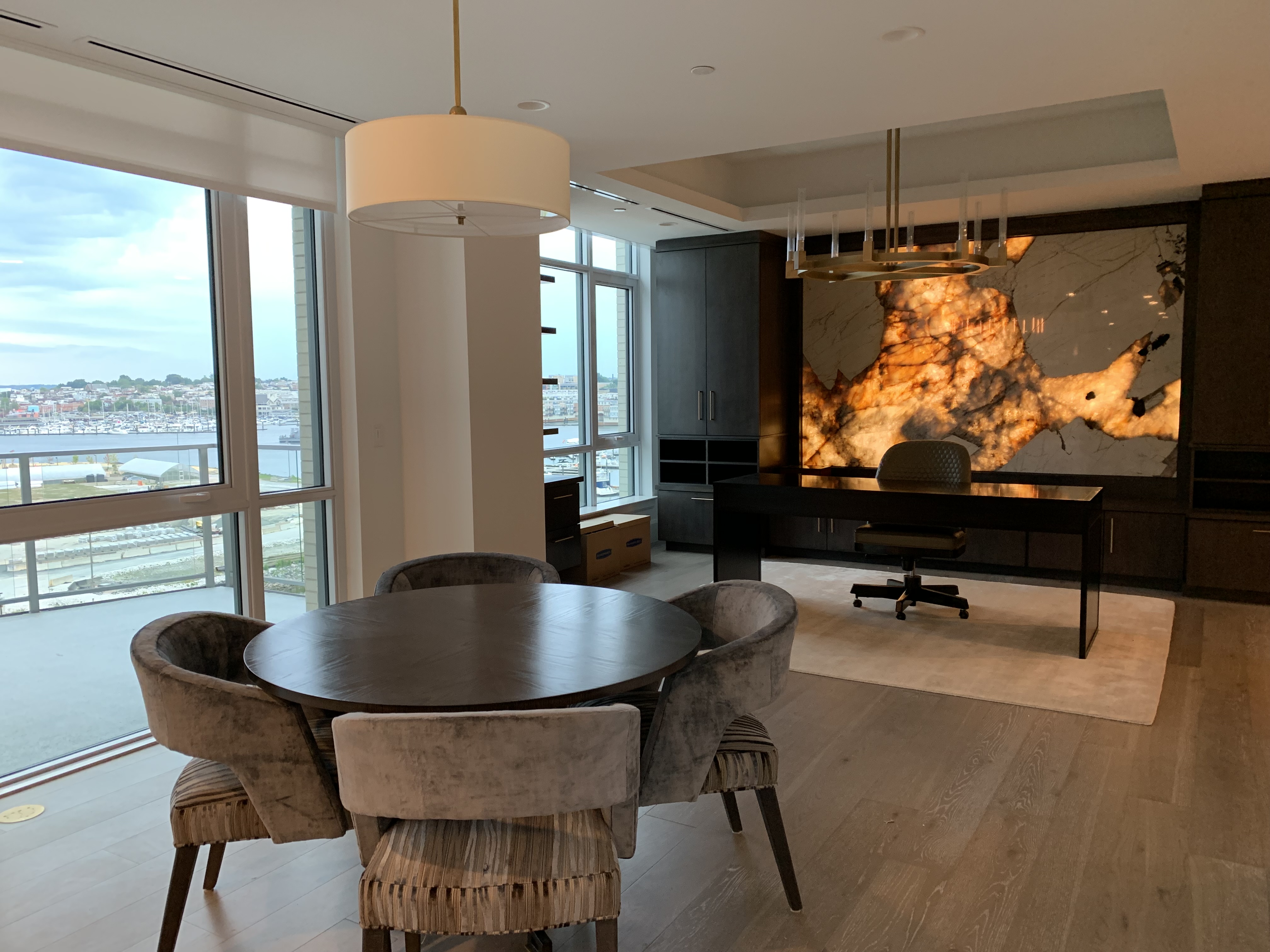
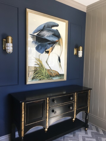
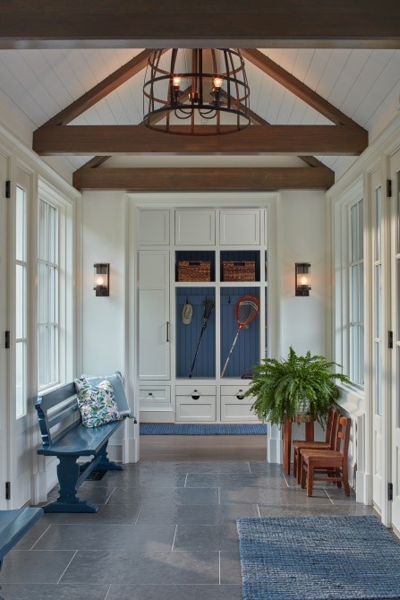
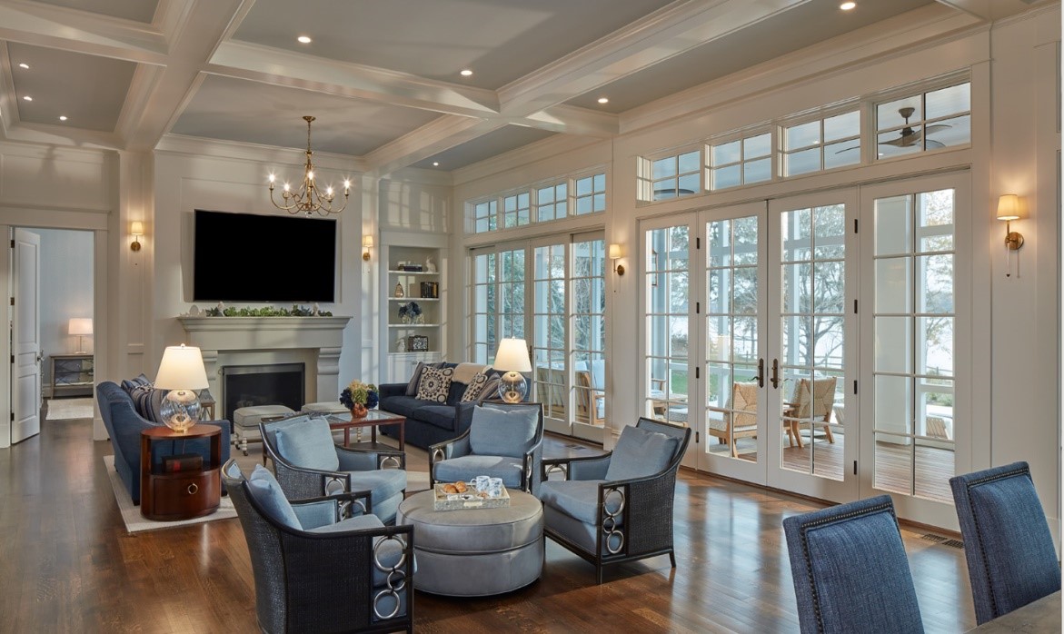
Understanding the architectural layout of your home and how paint colors transition is critical. Further, understanding the volume of the space and the orientation to natural light is significant. Our architectural and interior design teams understand the importance of these transition areas and how paint colors will transition to one another and to the light. In the increasingly popular open concept floor plan, these transitions are key and lead to us specifying fewer paint colors to avoid open sight lines with multiple paint colors. Our eye senses interruption when design elements, including paint, do not flow throughout an open space. We aim to have your eye carry seamlessly throughout your home so it picks up on all of the beautiful moments.

4. Don’t forget trim and ceilings.
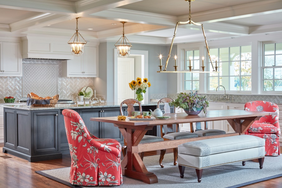
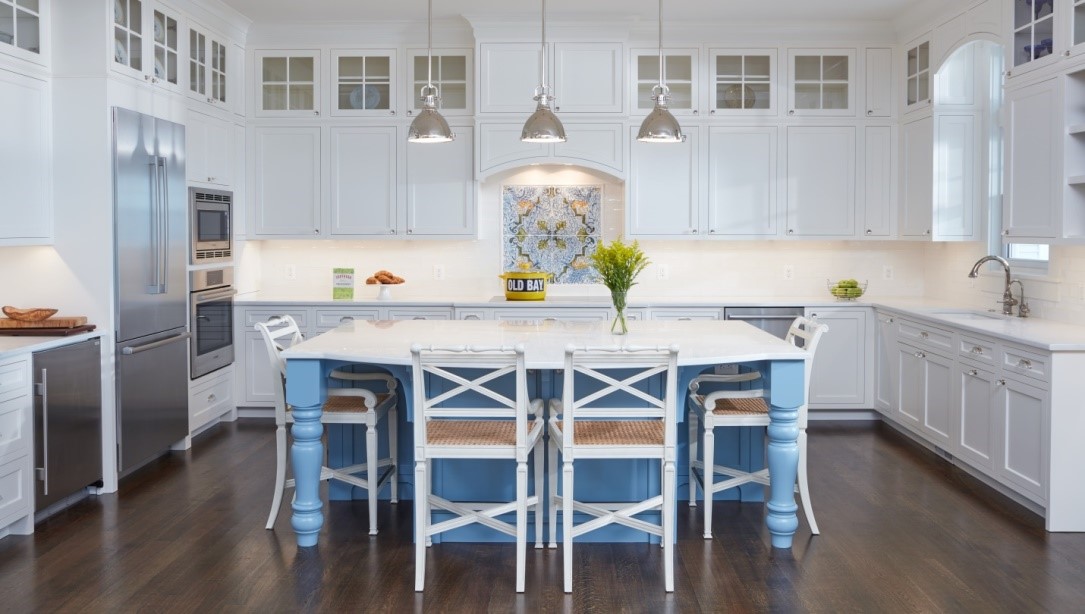
Many times, we recommend painting the trim and ceiling in the same color but in different sheens (stay tuned for sheen advice below). Going back to transition, knowing how the trim tracks from space to space or even within a single space is crucial. It is not uncommon for us to specify the same trim and ceiling color throughout an entire house. This provides a level of continuity as you move throughout your home. This approach is frequently taken in the heart of the home – the kitchen. If you love a timeless white kitchen (which many of our clients do), you will appreciate the continuity of the cabinetry matching the trim color. 

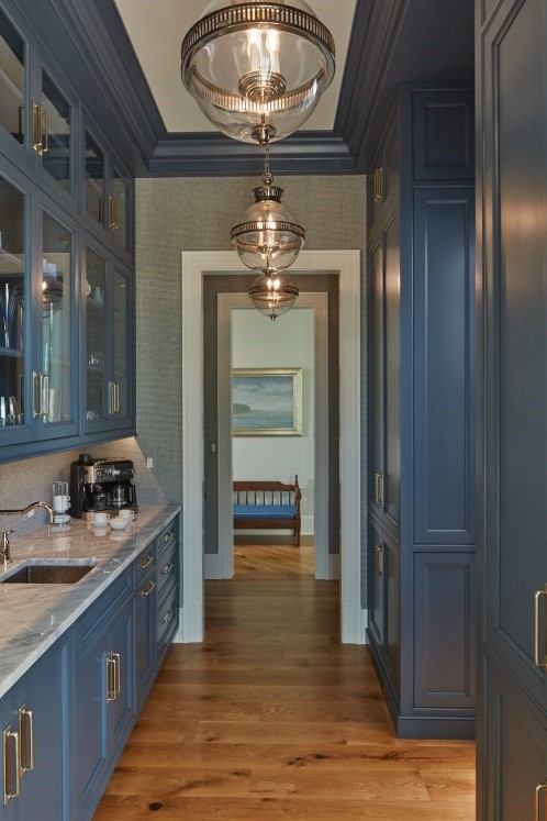
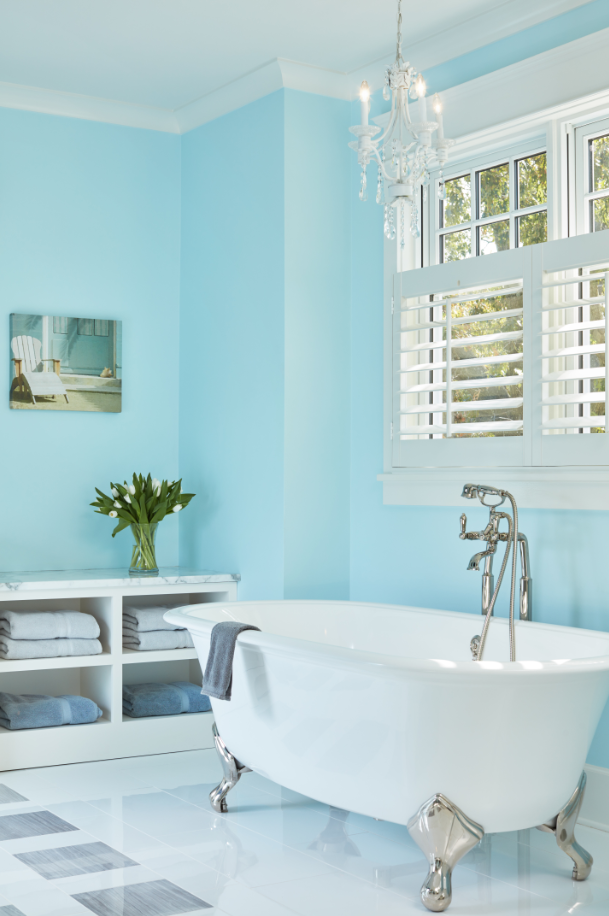
5. Utilize the existing color palette.
How do you select colors from here? Use the design elements and materials in the space! When we work through the design process, we select materials that tonally come together to create a holistic design. This means that the color palette is already set when it comes to selecting that perfect paint color! Our cabinetry finishes, fabrics, and rugs all influence the direction. Still wanting a bit of color? Pop a pale blue or a fun wallpaper on your ceiling to compliment your palette. One of our “go-to” collections is Benjamin Moore’s OC collection. Check it out!

6. Brush up on sheen.
Paint sheens are fairly straightforward if you keep a few guidelines in mind. There is a general rule of thumb: the higher the sheen, the higher the shine. And in turn, the higher the shine, the more durable and wipeable that surface is. More durable, sounds like a no brainer? A higher gloss sheen will also highlight any potential imperfections in your drywall. Last tip before you dive into sheens: check with your manufacturer for the differences in sheen. There are subtle differences between manufacturers.

PCA Cheat Sheet:

  • Flat paint = No Shine
  • High Gloss= All Shine
  • Eggshell, Satin, & Semi-Gloss = In between Flat & High Gloss

Ceilings and trim are also fairly straightforward. We recommend flat for drywall ceilings and semi-gloss or satin for trim. Semi-gloss has been traditionally painted on trim for many years, but we are seeing a trend towards the lower sheen of satin. This sheen level provides that perfect amount to highlight the beauty of the trim profile but at a lower level of gloss.

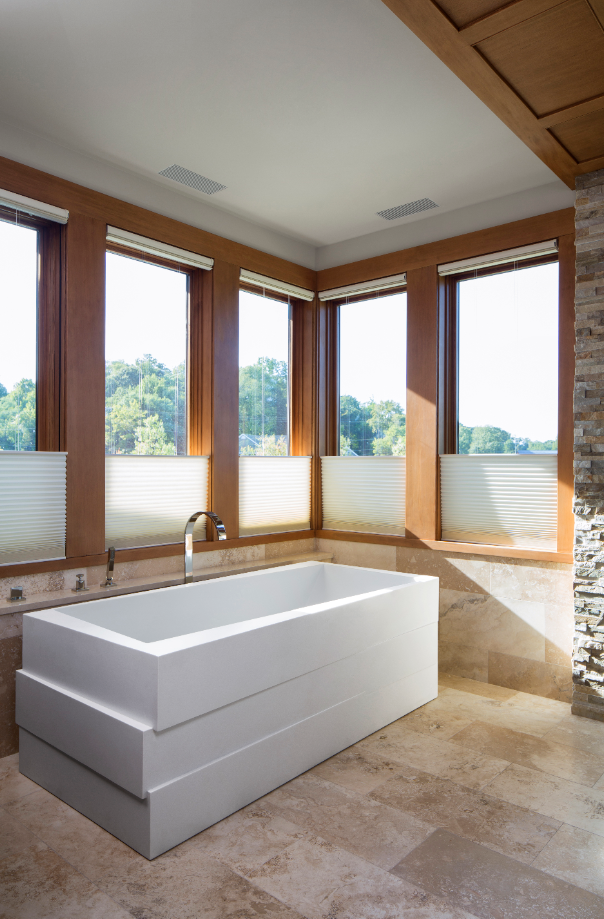
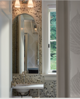
Our “wet areas”, the bathrooms and laundry rooms, need durability against potential moisture while also avoiding the look of a high gloss sheen. As a broad stroke recommendation, an eggshell or a satin wall paint sheen will give you that extra bit of protection without the “glare” of a high gloss sheen.

7. Sample, sample, sample (and sample again).
Bigger is better! Larger format samples allow you to see the color – a 5’x5’ area should do the trick! If you are able to sample on multiple walls within a space, do it. Color can change throughout a space and light is key. If you can, live with the color and feel it. Better yet, look at the color when you will be using that particular space the most during the day or evening. And remember, you may need more than one round of samples and that is okay! Color is an important aspect of the design.

We hope you find these tips useful!

Spa Living at Home

With the pace of modern life seemingly increasing all the time and the boundaries of the nine-to-five work day expanding with unceasing electronic communication, who doesn’t sometimes feel the need to escape to a peaceful oasis of serenity for a relaxing interlude? Fortunately, that escape can be just around the corner with a well-designed, spa-like bath in your home. Far from the cramped, utilitarian spaces many of us remember from childhood bathrooms, a luxurious custom bathroom can be spacious and bright, and as soothing or dramatic as your imagination can make it.

The finish materials have an outsized impact on the character and mood of any space, and luxury baths are no exception. The need for water resistance around tubs and showers naturally leads to using tile floors, although wood floors are suitable for, and often used in, powder rooms. Within the world of tile, though, the options are practically limitless. Natural stone can run the gamut from glossy marble to rustic travertine. Water-cut stone mosaics provide intricate patterns and colors. Porcelain and other ceramic tiles are available in every color and shape imaginable. Large-format tiles give a sharp, modern feel to a space, while porcelain planks can mimic the appearance of weathered wood. Stone slabs and tile can be used as wall finishes as well, as backsplashes, wainscoting, or full-height finishes. The use of an unexpected material, such as irregular, natural stone or pebble-like tiles, can add a dramatic touch to a composition.

Our moods respond dramatically to color, so the material and color palette should combine to set a comforting tone. Many clients are attracted to soothing blues, grays, and earth tones, which have a calming effect and can be combined with a variety of accent colors.

Bringing natural light into any space makes it more inviting, and if you’re fortunate enough to have a beautiful view from your bath, you’ll want to be sure to take advantage. Nothing could be better than lounging in a comfortable soaking tub with a view of the water.

The bathtub is naturally one of the centerpieces of a spa-like bath. Although platform tubs can be a beautiful solution, the current trend is very much toward free-standing tubs. The classic claw-foot bath is still around, but now it can be had with fun design features like chrome feet, which add interest.

Other free-standing tubs look more like modern sculptures than bath fixtures, with shapes ranging from classical to organic to geometric. More and more synthetic materials are being used in the manufacture of tubs, which help to reduce the weight from the cast iron of yesterday, and also help retain the warmth of the bath water. If simply soaking isn’t your cup of tea, tubs are available with whirlpool jets, bubble massagers, and chromatherapy.

The shower is the other major amenity in a luxe bath, and like the tub, you might be surprised at the variety of fixtures and features to choose from. Multiple shower heads, waterfall heads, rain heads, hand sprays, and body sprays can be combined to give the user anything from a gentle spring rain to a full-blown monsoon. Steam showers provide the ultimate relaxing spa experience. Finally, curbless showers are becoming more popular in high-end homes, and are easier and safer to enter, allowing people to stay in their home even if they lose mobility.

Finally, don’t forget the delightful little details than can add so much to the bathing experience. Heated floors can easily be installed under tile floors to provide a comfortable warmth underfoot on a chilly morning. Towel warmers, either installed in a drawer or wall-mounted as a towel rack, offer that just-out-of-the-dryer feeling every day. And if you want soothing music while you soak, or to catch the morning traffic report as you start your day, you can integrate audio and video components into the space. Just be careful – you may never want to leave!

Written by Alan Cook, studio manager at PCA

An Urban Oasis in Harbor East

Purple Cherry Architects was excited to take on a new challenge when we were offered the opportunity to design a 3,400 square-foot urban condominium. A client for whom we had recently designed a custom waterfront home wanted to create a spacious and stylish retreat in Baltimore’s thriving Harbor East neighborhood, in a new multi-use building containing retail, apartments, and condominiums.

After taking over a space that had been originally divided into three smaller units, the owner asked the PCA team to design a unique living space that took advantage of the sweeping views of the Inner Harbor and Key Bridge. We responded with a design that placed the luxurious master suite at one end of the long unit and the guest bedroom with ensuite bath at the other end, ensuring privacy for the owner and guests.

Between the private areas, the public spaces unfold along a fully glazed wall with panoramic views and private balconies. The modern kitchen is open to the dining and living areas beyond, creating a dramatic open great space with a gracious proportion that is rare in a multi-family building. The ceiling height was increased in the living room by introducing a tray ceiling, creating visual interest and highlighting the importance of the space. Cove lighting provides an accent and creates a relaxing ambiance, allowing the full-height stone fireplace with brass accents to shine.

Adjacent to the open living space, but slightly separated and defined by built-in cabinetry and a second tray ceiling, the home office contains possibly the most dramatic feature of the project- a six-foot by eight-foot granite and quartz stone slab set into a wall. Illuminated from behind to allow the breathtaking veining of the stone to shine, the slab from Gramaco appears at times like a giant fireplace, warming the space with an exhilarating glow.

A fully equipped, mirrored home gym provides a workout space for the owner at any time. Post-exercise, a spacious steam shower beckons from the elegant marble-tiled master bath.

Purple Cherry Architects was fortunate to provide interior design services for the project as well as the architectural design. As this was the second project we had completed for this client, we felt we understood the client’s taste, but the design aesthetic for the condominium project was much more modern and urban than the previously completed country house. Having the chance to work with the same client on two projects with such different moods was an unusual opportunity, which we were grateful to have. Our architectural and interior design teams worked with the owner on all aspects of the design, from furniture, rugs, and fixtures to colors, tile designs, and custom cabinetry and millwork.

The project came together beautifully, with the architecture and interior design elements combining to create a truly one of a kind oasis of serenity and comfort in the heart of a busy city.

Written by Alan Cook, studio manager at PCA

Q&A Time with PCA Interiors

You asked and we answered! There are many ways to approach interior design. With the vast amount of available products to choose from, it can be overwhelming. The interior design team at Purple Cherry Architects decided to ask our Instagram followers for their top interior design questions. Let us share with you findings and solutions…

Q: Is wallpaper dated? It seems like a big commitment.

Absolutely not! It is that “little something extra.” We are seeing beautiful linens and grasscloths, subtle and bold printed patterns, and even embossed leathers. There are so many applications to use with wallpaper. Many of the homes we design have anywhere from 9’-11’ ceilings. Adding wallpaper to a space is a great way to fill a wall especially in a space with high ceilings. Get creative with where you use wallpaper! We love to add wallpaper in the back of a built-in bookcase to really make it pop. Still afraid of committing? Start small. Powder rooms are generally smaller in scale and give you an opportunity to test out your curiosity. This Zoffany wallpaper gave one of our clients the impact she wanted but still remained neutral and classic.

Q: What paint colors would you recommend for exterior stucco?

The key is to look at the house holistically and then to establish a color palette. Consider not only the stucco but also the other exterior materials such as roofing, siding, and hardscape. If you have stone or a stone veneer you will want to select a color that is pulling off of that material. We frequently specify Benjamin Moore colors found in the OC collection. These stunning paint colors, time and time again, have proven to be true staples. Try colors like Benjamin Moore Balboa Mist and China White

And don’t forget – sample, sample, sample, before you commit to a color palette! I know that when a color goes larges, it gets brighter. It takes a little more effort, but it is so worth it in the end!

Q: Do all of your metal finishes in a kitchen or bathroom need to match?

Yes and no. Does that answer the question? As interior designers, we look at the design as a whole. Between plumbing fixtures, lighting fixtures, door hardware, and all the way down to the cabinet hardware. It’s important to understand the careful balance of mixing metal finishes so that they harmonize well. We certainly specify and appreciate many metal finishes but the most common are: polished nickel, polished chrome, oil rubbed bronze, and brass. Brass has come a LONG way, and it is not the brass we all know and hate from growing up. Polished nickel and polished chrome pair nicely with both oil-rubbed bronze and brass tones. Also, the right oil-rubbed bronze and antique brass work together. It is a careful balance of combining a cooler tone metal with a warmer or darker tone metal. It can be done and it can be done well. We do have clients who prefer all of the metal finishes to match and that is ok too!

Q: I fell in love with a fabric but I am worried it won’t stand up well on a chair I am having re-upholstered. How do I know if it is durable enough to use?

There are several factors to consider when selecting a fabric for upholstery use. The weight of the fabric, and the content are essential. Upholstery weight fabrics need to be thick enough so it can stand up to use and time. If you use a fabric that is too thin, you will experience the fabric actually shifting over the cushion which will result in pilling. We frequently will do a treatment called “knit backing” which adds an extra layer to the backside of the fabric to give it more stability. Durability is a must! We hear this from our clients on a regular basis. With today’s hustle and bustle, we do not want to worry when we get home. We do not want to chase down the child, dog, or just clumsy house guest when they are using the newly upholstered chair. Knowing fabric content is key when selecting a fabric. Natural fibers will always require more care, but several fabrics are now treated with Nanotex or Crypton which are both great worry-free options! Thibaut, Kravet, and countless other vendors are all jumping on the stain treatment train.

Q: Does artwork need to match the interiors of a room?

In the past, artwork has often been selected to match the room. We encourage our clients to select artwork that is subtly cohesive with the design. Pick the room’s main accent color, like a coral or even a moody teal, and have it pop an element in the artwork. Artwork is incredible, and we encourage our clients to select pieces that speak to their taste and lifestyle.

Q: I love subway tile. Is it still going to be in trend in a few years?

Subway tile is as classic as you can get. If you look at photos of Parisian apartments in the 1920’s, you can see subway tile gracing the walls. It is true, subway tile has “come back” but it is certainly here to stay. The clean, timeless look is the perfect backdrop for your kitchen backsplash or bathroom shower walls. Want to mix it up? Change the size, the color, the texture, or even add a pattern. Winchester Tile Company, who is carried by Chesapeake Tile in Baltimore, has a beautiful assortment of subway tile in varying sizes and designs.

Q: What rug would you recommend for a family room?

Family rooms and kitchens are the heart of the home. It is where most of clients’ families gather and spend the majority of their time together. The family room is being used as the extra office space for TV watching, game playing, and even the entertaining space when sports are on the television. Wool is the most durable natural fiber in rugs. It is cozy underfoot, has excellent insulating properties, and has good stain repellency. An additional fiber that is most commonly found in indoor-outdoor rugs is polypropylene. Perennials, who has primarily known for their fabulous indoor-outdoor fabrics, has recently launched a rug line. Their polypropylene rugs are soft to the touch and offer incredible durability. You can literally hose these rugs off! Their line has expanded where we can dream up any design or custom color any of their current patterns.

Purple Cherry Architects’ goal with each project is to create an intentional, functional and beautiful home. Our interior design team takes many approaches to formulate a design that works for the client and their lifestyle. We hope our readers have found these answers helpful and thank you to our Instagram followers for participating!

NY Now

Twice a year, thousands of vendors show up to the “NY Now” tradeshow at NYC’s famed Javitz Center to showcase their newest home and lifestyle products. Similar to the famous High Point furniture market in NC, the show is open to the design trade and our Purple Cherry interiors team went to check things out!

Our team works with clients to design functional and beautiful homes. It is common to move through the architectural and interior design process and not finish that last crucial step which is staging and accessorizing. Our clients are now asking for that layer of design and we are thrilled to be a part of it. It is the final touch of the design that really gives you that feeling, “ah, yes, it is finished.”

Our main goal at the show was to develop relationships with new vendors. If we found a piece or line for a client, even better! We love to find the newest products and trends. We walk the endless aisles seeking the common trend we can see through thousands upon thousands of vendors. Here’s what we took away this 2019 year!

1. Natural Elements
The use of natural woods, tortoiseshell, and bamboo was found in everything from tabletops to furniture. From Made Good’s new “Juleen” braided hyacinth console to Selamant’s rattan coffee table, it became clear this was a strong design element throughout the show. These pieces offer a warmth and texture that set them apart and offer you offer you a more artisanal edge. This look is in stark comparison to the industrial trend of modernism starkness we saw not too long ago.

2. Color 
The darker, bolder palettes appear to be a distant memory. Beige, off whites, and blush (still going strong!) were a common color story throughout. The natural materials and textures we are seeing certainly influence this neutral color palette. Colors we frequently specify for our clients like Benjamin Moore’s Wind’s Breath, White Dove, and Muslin would be the perfect compliment to the natural elements and keep with today’s trending colors.

3. Handmade
The collection of handmade goods was strong. With the internet at our fingertips we have access to endless product, usually mass manufactured. There appears to be a movement to procure the one-of-a-kind product with a strong emphasis on great design. Handmade ceramic dinnerware with irregularities in shape and color were seen throughout. Tenango’s hand carved primitive console table fulfills both the natural and handmade trend.

4. Customizable Dinnerware & Accessories
Several dinnerware vendors now allow the designer to customize their designs or come up with a design all on their own! The collaboration between client, designer, and vendor at this level is new and we are thrilled to see vendors giving us another design opportunity. This could be seen in Caskata dinnerware line which allows you to customize size, color, and pattern. Set your table apart by customizing your dinner plates or platter with a custom map of your hometown. Their classic blue and white line would be a perfect compliment to several of our client’s homes.

5. Artisanal
Hand-blocked prints were scattered throughout the show. From Pomegranate’s tablecloths and napkins to Walter G’s ready-made pillows, vendors offered an extensive line with several patterns and colors to choose from. The artisanal quality of these textiles is in line with the global trend we have seen in recent years in both home and fashion. Ultimately, we discovered this global trend is here to stay!

In conclusion, there is a “back to basics” vibe going on in the industry. The common trait we see throughout all of these trends is the movement to design of the old. The materials and craft of the product is more of an interest and the popular neutral color palette is a perfect complement to it. We were thrilled to have this exposure and return to the office with freshly ignited creativity! At PCA, we appreciate all styles of architecture and design!

Spring Design Trends

Our interiors team gathered incredible knowledge and a multitude of design ideas at this year’s spring High Point Market. One of the common spring design trends they noticed this visit is the use of mixed material furniture. The marriage of contrasting natural materials create pieces that are both strong and elegant. Pictured here are examples of this application. The cocktail, console, and end tables (top) feature a black metal base with a smooth, solid wood top. The desk (bottom) is made of an iron base with embossed shagreen leather surface top. Incorporating these design features into projects will be a fun trend to utilize and see!

spring design trends

Architecture & Interiors