Interior Paint Selection 101: How to Choose the Right Paint Colors for Your Custom Home
Selecting interior paint colors is one of the most exciting moments in designing a custom home, but it is also one of the most misunderstood. While many homeowners want to begin with paint, our interior designers often save those final color selections until much later in the design process. The reason is simple: the most successful interiors are built around a cohesive palette of architectural materials, furnishings, lighting, and finishes—not the other way around.
Whether you’re building a luxury custom home, renovating an existing residence, or refreshing a single room, these seven principles will help you make paint selections that feel timeless, intentional, and beautifully integrated with your home’s overall design.
1. Exercise Your Patience.
Believe it or not, paint is one of the last interior design decisions we make—and it is usually one of our clients’ first questions at the beginning of the design process.
Just like you can box yourself into a corner, you can also box yourself into a design by choosing a paint color too early. Selecting an exact paint color before cabinetry, flooring, countertops, tile, lighting, furnishings, and fabrics have been finalized limits the possibilities for creating a cohesive interior.
Instead, we prefer to establish the overall feeling and color palette first. Do our clients gravitate toward warm neutrals, soft whites, earthy tones, or richer, moodier interiors? Once the major interior design selections have been made, we have thousands of beautiful paint colors available to perfectly complement the home’s architecture and finishes rather than forcing every other decision to work around one early choice.
2. Do Your Research – It’s Worth It.
The more inspiration you gather, the more confident you’ll be in your final selections.
Pinterest, Houzz, architecture websites, interior design publications, and luxury home photography are wonderful resources for discovering the types of spaces you’re naturally drawn to. As you collect inspiration, pay attention not only to what looks beautiful, but also to how each space makes you feel.
Do you gravitate toward warm whites and creamy neutrals? Are cooler gray palettes more appealing? Maybe you’re drawn to bold, saturated colors or dramatic accent walls.
The next question is just as important: Can you imagine living in that space every day?
Color has an incredible impact on how a home feels. Many homeowners are initially attracted to cool gray interiors because they photograph beautifully, yet ultimately discover they prefer warmer tones once they imagine living in those spaces. Understanding your emotional response to color is every bit as important as understanding the color itself.
3. Understand How Paint Colors Transition Throughout Your Home
One of the most overlooked aspects of interior paint selection is understanding how colors transition from room to room.
The architectural layout of your home, ceiling heights, natural light, window placement, and overall floor plan all influence how a paint color will appear. A color that looks beautiful in one room may feel completely different in another simply because of changing light conditions.
Our architecture and interior design teams spend a great deal of time studying these transitions. In today’s increasingly popular open-concept floor plans, long sightlines make continuity especially important. Rather than introducing unnecessary visual interruptions with numerous wall colors, we often specify fewer paint colors throughout the main living areas.
This allows your eye to move naturally through the home while appreciating the architecture, millwork, furnishings, and carefully selected materials without feeling visually interrupted. A cohesive whole-home color palette creates a calmer, more timeless environment.
4. Don’t Forget the Trim and Ceilings.
Walls aren’t the only surfaces that deserve thoughtful consideration.
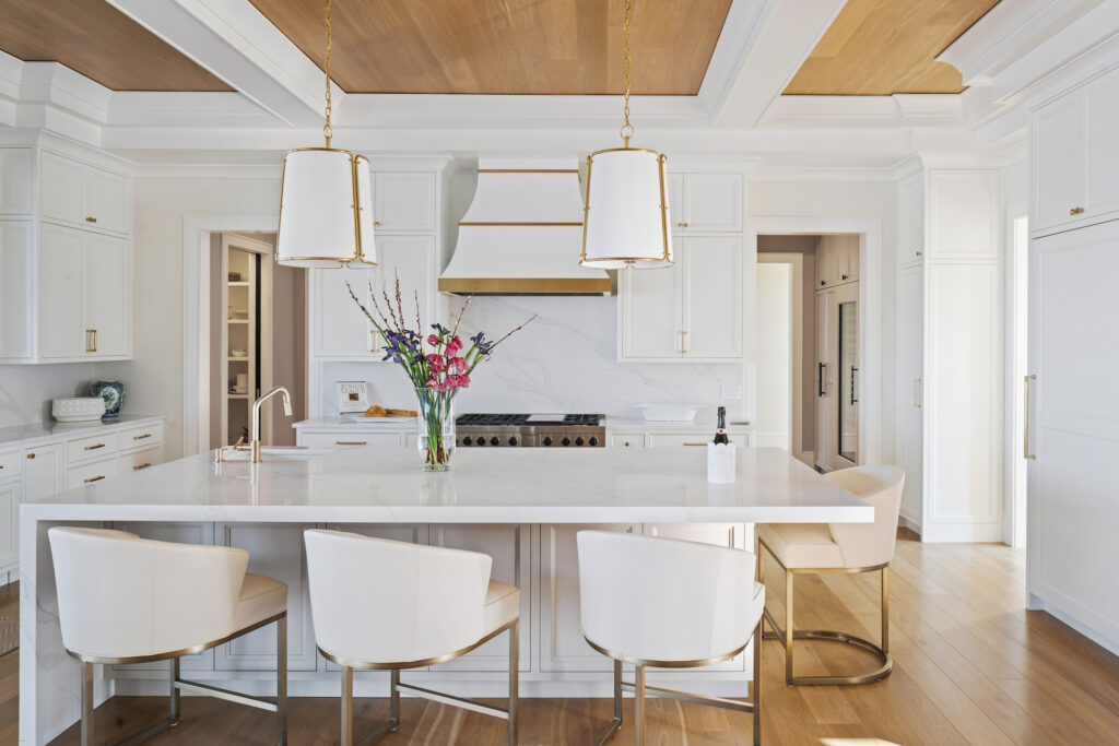
In many of our luxury residential projects, we recommend painting the trim and ceiling the same color using different paint sheens. This subtle approach creates continuity while still allowing each surface to perform differently.
Understanding how trim travels throughout the home is especially important. It is not uncommon for us to specify one trim color—and often one ceiling color—for the entire residence. This consistency creates visual harmony from room to room and simplifies future maintenance.
The kitchen is a perfect example. Many homeowners are drawn to timeless white cabinetry, and when that cabinetry closely coordinates with the trim color, the result feels elegant, intentional, and enduring rather than trendy.

5. Let Your Existing Material Palette Guide You
By the time paint colors are selected, the design has already begun telling you where to go.
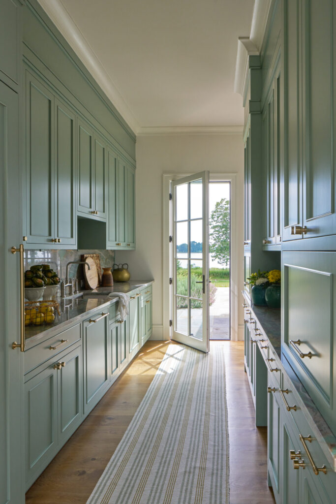
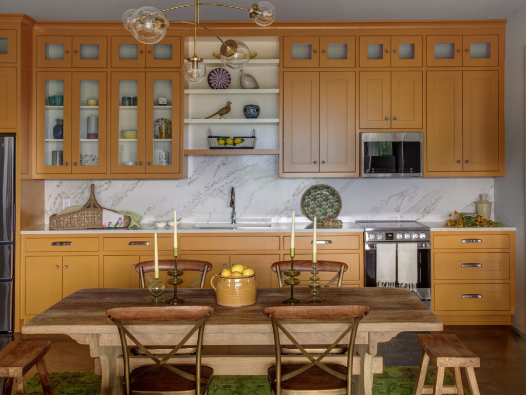
Cabinet finishes, natural stone, hardwood flooring, tile, fabrics, rugs, plumbing fixtures, lighting, and furnishings all contribute to the home’s established palette. Paint should support those materials—not compete with them.
When we design a home, every finish is selected to work together harmoniously. That means the ideal paint color is usually already hiding within the palette we’ve created.
If you’d still like to introduce a touch of personality, consider adding color in thoughtful ways. A pale blue ceiling, richly textured wallpaper, or an accent space can add visual interest while maintaining the home’s overall balance.
One of our favorite starting points continues to be Benjamin Moore’s OC Collection, which offers a beautiful range of timeless whites and soft neutral paint colors that work exceptionally well in luxury residential interiors.
6. Brush Up on Paint Sheens.
Choosing the correct paint sheen is just as important as selecting the right color.
A simple rule of thumb is:
- Eggshell, Satin, and Semi-Gloss = Everything in between
- Flat = No shine
- High Gloss = Maximum shine
Generally speaking, the higher the sheen, the more durable and washable the finish becomes. However, increased gloss also highlights imperfections in drywall and surface preparation.
It’s also important to remember that sheen levels vary slightly between paint manufacturers, so always review the manufacturer’s specifications before making a final decision.
Our General Sheen Recommendations:
- Ceilings: Flat paint provides a soft finish that minimizes imperfections and reduces glare.
- Trim: Satin or semi-gloss remain our preferred choices. While semi-gloss has traditionally been the industry standard, we’re increasingly specifying satin because it beautifully highlights millwork while offering a softer, more contemporary appearance.
- Bathrooms and Laundry Rooms: These spaces benefit from increased durability and moisture resistance. Eggshell or satin wall finishes provide added protection while avoiding the highly reflective appearance of glossier paints.
7. Sample, Sample, Sample (Then Sample Again).
When it comes to paint, larger samples always produce better results.
Rather than relying on a small paint chip, we recommend painting at least a 5′ x 5′ section of wall. Even better, sample multiple walls within the same room. Paint colors change dramatically depending on the direction of natural light, the time of day, surrounding finishes, and even the weather outside.
Whenever possible, live with your samples for several days. View them in the morning, afternoon, evening, and under artificial lighting. Observe them when you’re actually using the room.
Don’t be discouraged if your first sample isn’t perfect. It is completely normal—and often expected—to go through multiple rounds before finding the ideal color.
After all, paint is one of the final details that brings an entire home together. Taking the time to choose thoughtfully ensures your interior feels cohesive, timeless, and uniquely your own for years to come.