Announcing the Pantone Color of 2020
New decade, new Pantone color. A crisp blue hue, PANTONE 19-4052 Classic Blue is timeless.
You may wonder, who is Pantone and why do they select a new color each year? The answer to that first question is they are a color consulting enterprise. In addition to selecting the Pantone color of the year, The Pantone Color Institute is the business department within Pantone that forecasts color trends globally, influences the top fashion runway colors, and provides guidance to companies on color to build their brand. For over 20 years, they have influenced the product development of several industries from home furnishings to fashion to graphic design. Their reach influences many of the products we see each and every day.
Human beings have a certain connection with color. It invokes emotion, nostalgia, and reflection. In what can feel like at times a chaotic world with the influx of technology, the intent behind the color selection is to induce a sense of tranquility. Leatrice Eiseman, the executive director of Pantone, issued her thoughts on the 2020’s color: “We are living in a time that requires trust and faith. It is this kind of constancy and confidence that is expressed by PANTONE 19-4052 Classic Blue, a solid and dependable blue hue we can always rely on. Imbued with a deep resonance, Classic Blue provides an anchoring foundation. A boundless blue evocative of vast and infinite evening sky. Classic Blue encourages us to look beyond the obvious to expand our living; challenging us to think more deeply, increase our perspective and open the flow of communication.”
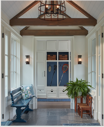
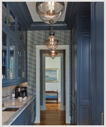
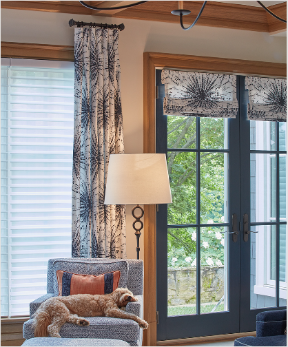
As we build a new era, Classic Blue instills a sense of serenity with this classic hue. The deep blue is reminiscent of nature and has frequently been described as the sky at dusk. Our local landscape has been impactful to the approach and overall design of our custom homes – from inside out. Nestled on the shores of the Chesapeake Bay, Annapolis has provided us a perfect haven to explore the current blues of today. The bay is imprinted on many of us, and blue color palettes can be found in many local residences. We are hard pressed to find a home we have worked on that does not have a shade of blue. From tinting the back of a custom built-in for that “pop” to painting a pair of beautiful French doors, we look to elevate our client’s homes with these subtle nuances by utilizing color.
In this busy world we live in, it is easy to gravitate towards colors that promise a sense of peace. With that being said, our Charlottesville, VA office comes immediately to mind. Annapolis may be the origin of Purple Cherry Architects start, but our principal, Cathy Purple Cherry’s, love of the “mountainscape” has propelled us into this picturesque town. Blue may come to mind when thinking of Annapolis, but with its calming nature, this hue blends well with the serene countryside.
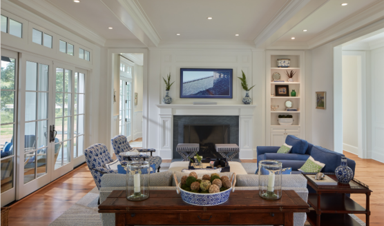
This deep blue hue is easily applied across different finishes, materials, and textures. The use of this impactful blue can be applied through the selections of fabrics, wallpapers, and even millwork finishes. Seen in our Eastern Shore Country Manor project, the artful use of the blue patterned fabric in contrast to the beautiful craftsmanship of the crisp white mantel and ceiling treatment provides a clean and orderly space for clients to rest, while the blue butler’s kitchen creates excitement for the user!
In, conclusion, PATONE 19-4052 is a beautiful addition to a long standing 20-year tradition. We look forward to seeing what this new era brings! For a peak at the last five years of Pantone colors, see below!
